Thank you all for your continued love and support of System Gate. We have a ton of news and announcements tonight. Each of these changes and improvements are meant to make the game more fun and enjoyable to all.
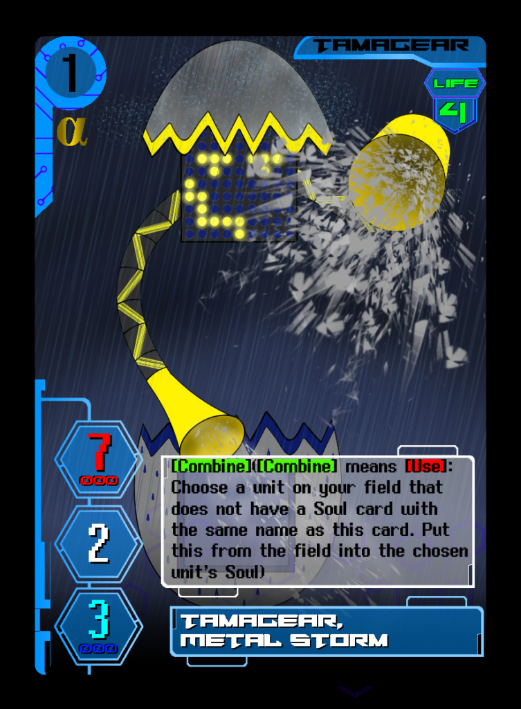
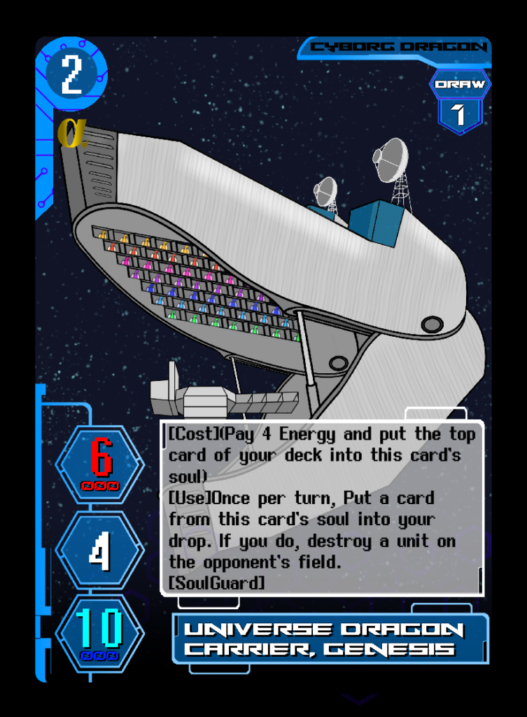
To begin, let’s go over the balance changes that will be happening based on the results of the World Tournament. To being, a huge congratulations to Ava Vassay, Devon Harman, Andrew Hoch, and Kenton Banyai for their knock out performances at the event! Three of the top 4 players all used Alpha Centauri. With a showing that strong, a small balance change was in order for the planet. All of the play testers put in a huge effort looking over the cards, decks, and strategies used by these players to see what the root cause of the strength was.
The #1 card that was brought up was Tamagear Metal Storm. This card was a 4 of inclusion not only in the top 3 decks from the World Championship, but a 4 of inclusion in every Alpha deck that has ever won a tournament. In Alpha Centauri, the Cyborg Dragons are meant to provide the defense, and the Tamagear are meant to provide aggression and options to those cards. Metal Storm simply doubled down on the defense, making it a bit too oppressive. Since Metal Storm is a Trial Deck card, it was converted to a card to help teach and demonstrate the [Combine] Mechanic to new players.
The #2 card was sighted in playtesting was Universe Dragon Carrier, Genesis. With recent additions to the Planet, it’s ability to destroy cards was simply too oppressive and un-fun to play against. Therefore, an adjustment to once per turn was essential.
These changes are not done simply as a means to “Nerf” Alpha Centauri, but to make the planet play more as it was designed to. These changes were done to keep the spirit of the Planet intact, similar to the reasons behind the recent changes to Uranus.
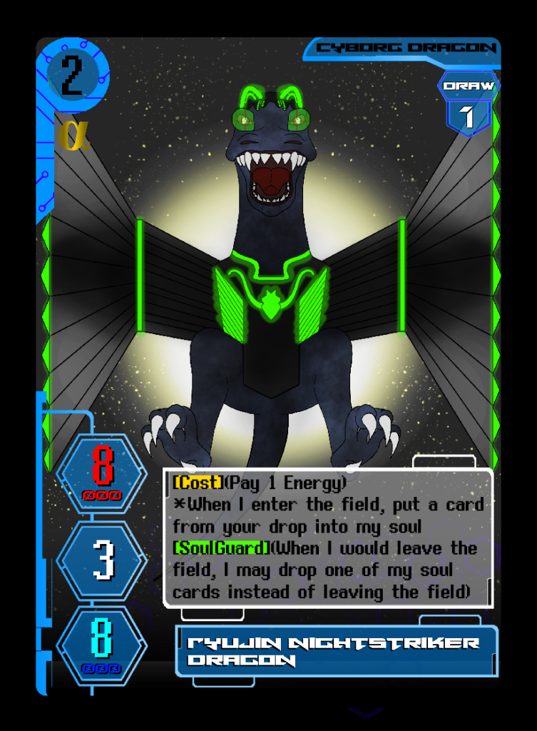
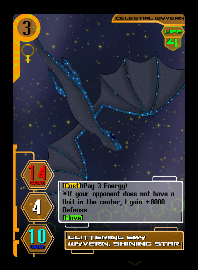
The next HUGE announcement we have tonight is a change to card text. Firstly, triggers will now be color coordinated to improve readability. Yellow for [Cost], Blue for [Counter], Red for [Use], [Green] for Keyword, and Black * for Automatic.
The next upgrade to card text is the switch from third person to first person card text. This will save on card space and increase readability. It’s like the card itself is talking to you!
Finally, [Summon Cost], [Cast Cost], and [Equip Cost] will all be written as [Cost]. This is again to reduce wasted card space.
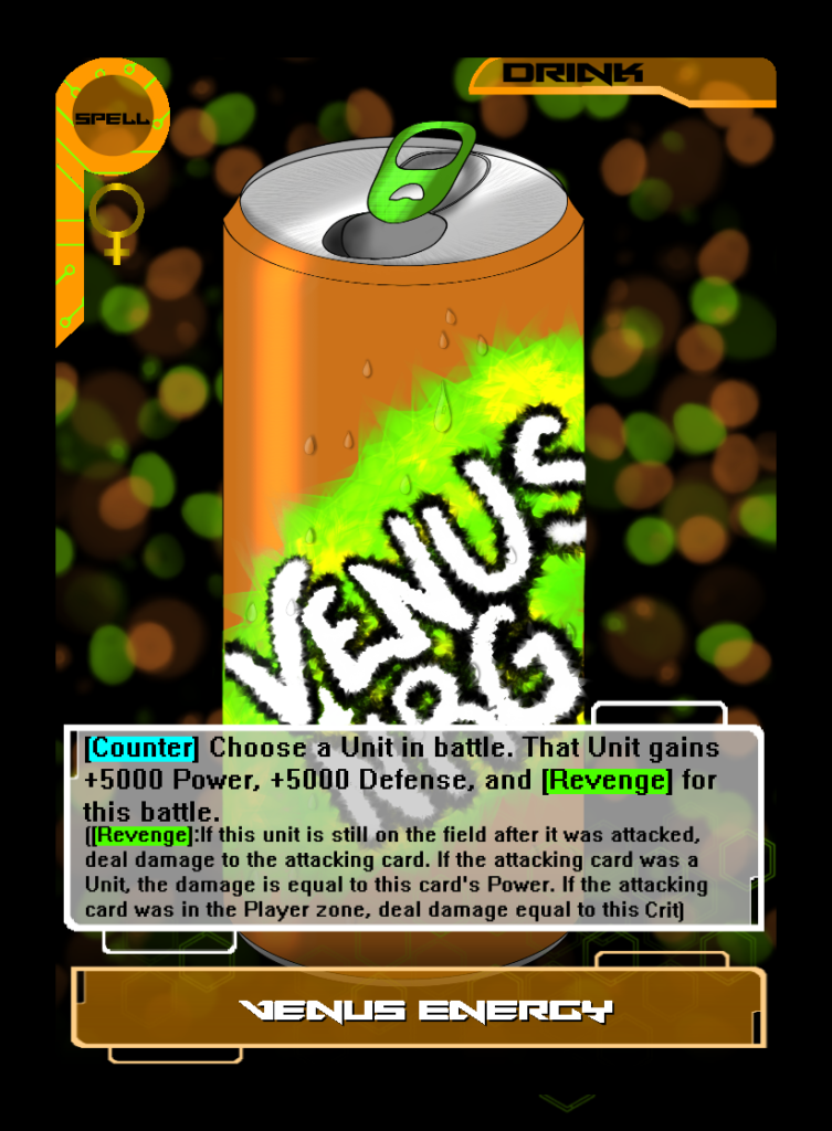
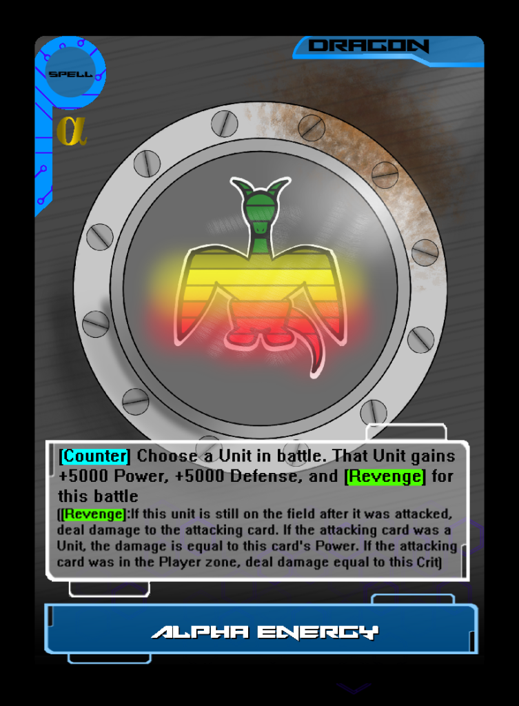
The final news we have to share with you tonight is the introduction of Version 2.0 Trial Decks! These upgraded decks will feature cards with the new wording and coloring to the card text as well as improved card ratios! These decks are guaranteed to give new players the best possible jumping off point to enjoy the world of System Gate! The printing of these new deck version will begin once the remains of our limited stock of version 1.0 is sold out.
Thank you again to everyone for playing and enjoying System Gate. Keep letting us know what you want to see next!

